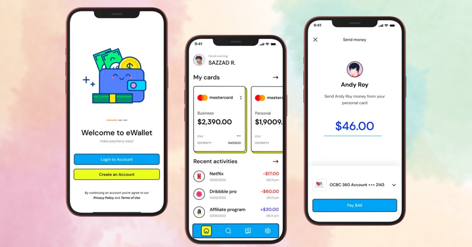
Add Neubrutalism Design to your Flutter App📱🔥.
A Guide along with resources to help you implement Neubrutalism Design Pattern in your Flutter App ✌️.
Image Credit: Dribble
Neubrutalism? What's that !!
Neubrutalism UI design is a popular style that has emerged in recent years, characterized by its use of simple, functional elements and a stripped-down aesthetic. It's an evolution of the Brutalist design movement that emerged in the 1950s, but with a more refined and contemporary feel. Neubrutalism emphasizes minimalism, functionality, and the use of raw materials like concrete and steel. It's a design philosophy that has been embraced by many designers and is particularly popular in the tech industry.
This Video will help you understand and get started with Neubrutalsim Design Style 😁.
Here are some amazing examples of Neubrutalism Design UI from Dribble🚀.
Neubrutalism in Flutter How ??🤔
First and foremost, neubrutalism is all about using a monochromatic color scheme. You can achieve this in Flutter by using shades of a single color for your app's background, text, and other UI elements. Contrast can also be achieved through the use of different shades or complementary colors to highlight specific elements.
Choose a Monochromatic Color Scheme😅
- The first step in designing a neubrutalist style UI is to choose a monochromatic color scheme. This means using a single color or shades of a single color for your app's background, text, and other UI elements. Typically, neubrutalist designs use muted colors like grey, beige, or brown and black.
Keep It Simple 🙄
- Simplicity is a key element of neubrutalist design. Use minimalistic icons and typography to keep your UI clean and uncluttered. Avoid the temptation to add too many elements to your design, as this can distract from your app's core functionality.
Maintain Asymmetry 🤌
- Asymmetry is another key element of neubrutalist design. You can experiment with using widgets that are intentionally unbalanced or creating custom layouts that are not perfectly aligned. This can create a sense of tension and dynamism in your app's design.
Typography 🖊️
- Typography can be an excellent way to add personality and character to your neu brutalist design. Experiment with different fonts, sizes, and weights to create a unique look for your app. In Flutter, you can define custom typography styles using the
TextStylewidget. Some Fonts that go best with Neubrutalist Design are Anton and Antonio.
- Typography can be an excellent way to add personality and character to your neu brutalist design. Experiment with different fonts, sizes, and weights to create a unique look for your app. In Flutter, you can define custom typography styles using the
Use Heavy Shadows 🤯
- Heavy shadows can add depth and dimension to your neubrutalist design. In Flutter, you can use the
BoxShadowwidget to create custom shadows for your UI elements. Experiment with different shadow colors, blur radii, and offset values to create a unique look for your app.
- Heavy shadows can add depth and dimension to your neubrutalist design. In Flutter, you can use the
Does sound like a lot to do doesn't it? Well, I have another short way of adding Neubrutalism Design to your Flutter App 😉, Let's explore the 2nd and arguably the better option.
So keeping in mind the design principles of Neubrutalism, and making it easy for developers to implement the Design in their Projects I've created a Flutter Package to make the process simpler it's called neubrutalism_ui.
Introduction:
"Neubrutalism UI is a comprehensive UI kit for Flutter that incorporates the principles of Neubrutalism design. With this package, you can easily add beautiful and functional UI components to your Flutter app in a style that emphasizes simplicity and minimalism.
The package includes a variety of UI components such as buttons, a Search Bar, a Container, and more, each designed with a subtle shadow and rounded corners that add depth and texture to your app. You can customize the appearance of each component to fit the specific needs of your app, including changing the border radius, depth, color etc.
Example:
NeuTextButton:
Neubrutalism.neuTextButton(
              buttonColor: Colors.teal,
              buttonHeight: 60,
              borderWidth: 2,
              onPressed: () {
                print("object");
              },
              buttonWidth: 300,
            ),
The NeuTextButton and all the other Widgets of this package provide various parameters for developers to modify and twerk the values according to their needs.
Counter App but in Neubrutalsim UI:
import 'package:flutter/material.dart';
import 'package:google_fonts/google_fonts.dart';
import 'package:neubrutalism_ui/neubrutalism_ui.dart';

void main() => runApp(Main());

class Main extends StatelessWidget {
  Main({super.key});

  final ValueNotifier<int> _counter = ValueNotifier<int>(0);

  @override
  Widget build(BuildContext context) {
    return MaterialApp(
      debugShowCheckedModeBanner: false,
      home: Scaffold(
        backgroundColor: const Color.fromARGB(255, 203, 125, 125),
        body: SafeArea(
          child: Column(
            children: [
              Padding(
                padding: const EdgeInsets.only(top: 20.0, left: 15, right: 15),
                child: Container(
                  alignment: Alignment.topLeft,
                  child: Row(
                    mainAxisAlignment: MainAxisAlignment.center,
                    children: [
                      Text(
                        'Counter',
                        style: GoogleFonts.anton(
                            textStyle: const TextStyle(
                          fontSize: 40,
                        )),
                      ),
                    ],
                  ),
                ),
              ),
              const SizedBox(
                height: 220,
              ),
              ValueListenableBuilder(
                builder: (context, value, child) {
                  return Text(
                    _counter.value.toString(),
                    style: GoogleFonts.anton(
                        textStyle: const TextStyle(
                      fontSize: 120,
                    )),
                  );
                },
                valueListenable: _counter,
              ),
              Row(
                mainAxisAlignment: MainAxisAlignment.end,
                children: [
                  Padding(
                    padding: const EdgeInsets.all(
                      35,
                    ),
                    child: Column(
                      children: [
                        Neubrutalism.neuIconButton(
                          icon: const Icon(Icons.add),
                          buttonHeight: 70,
                          buttonWidth: 70,
                          borderWidth: 3,
                          onPressed: () {
                            _counter.value++;
                          },
                          borderRadius: BorderRadius.circular(10),
                          buttonColor: Colors.white,
                          paddingData: const EdgeInsets.all(5),
                        ),
                        const SizedBox(
                          height: 40,
                        ),
                        Neubrutalism.neuIconButton(
                          icon: const Icon(Icons.remove),
                          buttonHeight: 70,
                          buttonWidth: 70,
                          borderWidth: 3,
                          onPressed: () {
                            _counter.value--;
                          },
                          borderRadius: BorderRadius.circular(10),
                          buttonColor: Colors.white,
                          paddingData: const EdgeInsets.all(5),
                        ),
                      ],
                    ),
                  )
                ],
              )
            ],
          ),
        ),
      ),
    );
  }
}
Contribution:
Currently, this entire package is managed by me (Deepraj Baidya), I'd be more than happy to have anyone who would like to join me on this Project, here is the link to the Project Repository
Signing Off😁:
If you found this article interesting, you may want to check out a few other things I wrote about Flutter.
Please don’t hesitate to write to me to deepraj@oncampus.tech, I’m always happy to hear from people reading my articles.
Connect with me:
